SARAH
ALONSO
DESIGN
CREATING AN INCLUSIVE SPACE OF INTERSECTION

Better Together
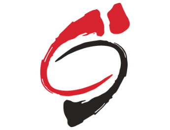

Old Logo
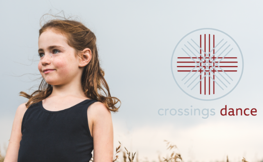
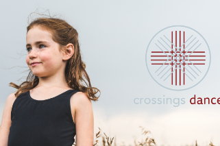
This project was done in collaboration with Purposefully Soulful Business consultancy. The aim was to rebrand Crossing Dance to create a brand that is inclusive, modern and wholesome.
Stemming from religious roots. Crossing Dance hoped to retain the spiritual element into their logo without being off-putting to a greater market. Successfully the logo was created served as both meaning intersections as well as Christ.
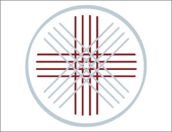

New Logo
"We have always been, and will continue to be, a place of intersection between: faith and art, tradition and innovation, and technique artistry...
Our logos draws from art history. The circle and intersecting threads represent unity, wholeness, infinity and God. The lines in our logo carry forward this theme and represent movement, dance, intersections and the interactions of the community at Crossings Dance. The cross at the centre represents our roots as a faith-based dance school and our mission to nurture the whole dancer." Crossing Dance Studio, Calgary
The Logo has been utilized in retail, signage, programs, web, social media and in advertising